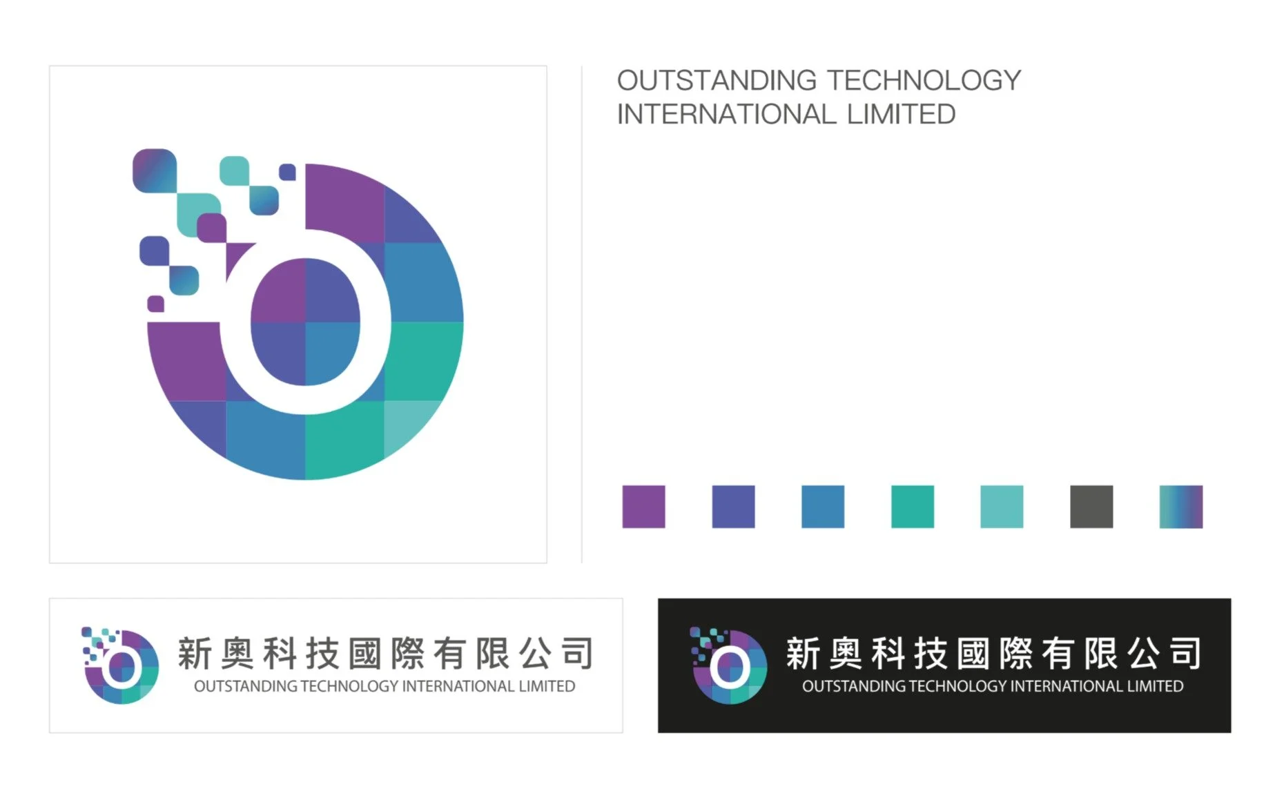
Branding
My client's company is a technology company that provides digital advertising services to their clients, such as holding concerts, KOL promotion and so on. Therefore, I designed the logo with the multi-color of green, blue and purple and divided the color into square shapes that are symbolic to our client providing the great diversity of digital services to their clients. In addition, the liquified shapes represent that our clients provide flexible solutions to their clients.
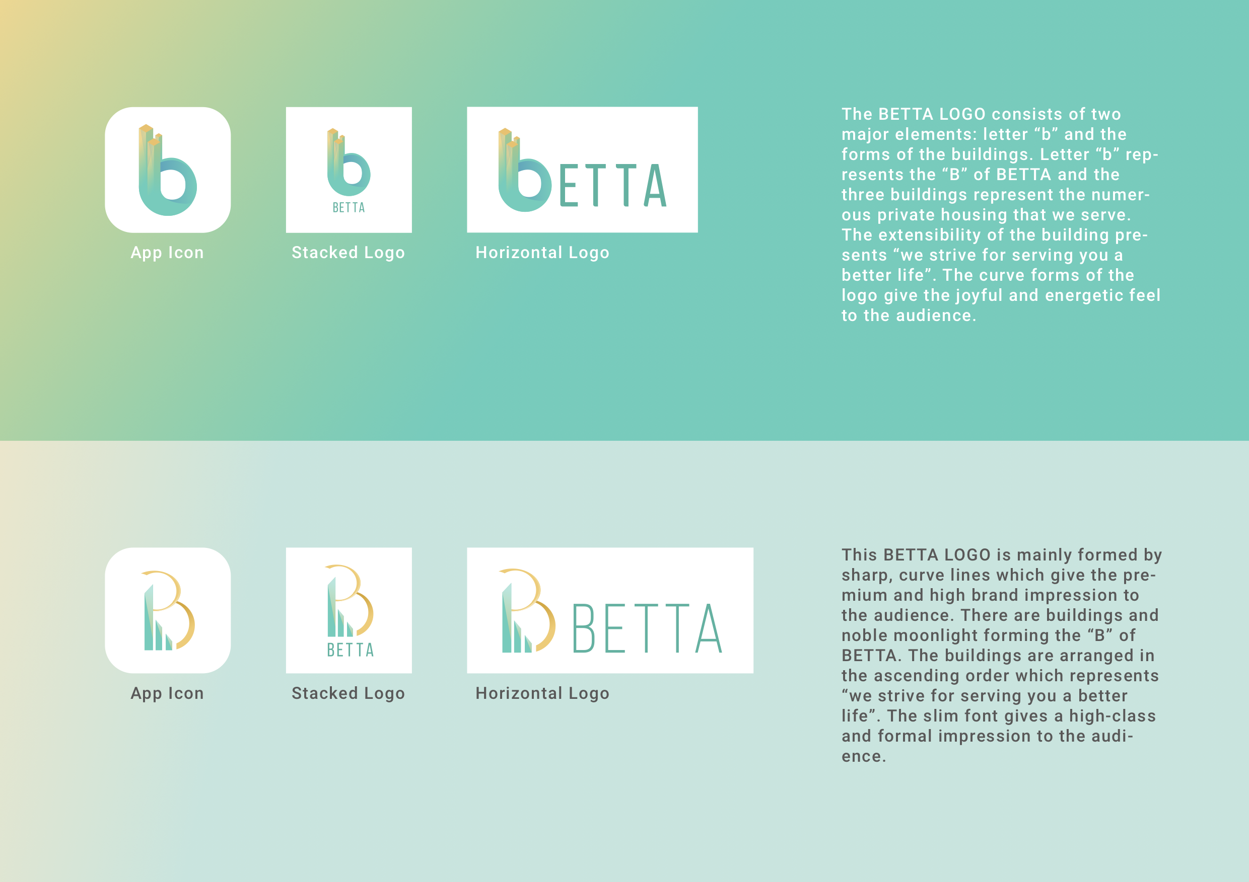
Branding
My client was promoting a residential application in which the resident can easily enter their home without entering the passwords in the front gate, be convenient to book the facilities and so on.